
- April 7, 2014
- Joe
- knowledge
- No Comments
 Marc Andreeseenn (the founder of Netscape) said it best:
The problem with new technology: new technology is not worth much until it’s worth a lot.
The previous applies almost to any technology widely adopted by humanity. Let’s take a look on how this phrase applies to mobile web design.
Since the dawning of mobile Internet, when GPRS and similar technologies were adopted (2000’s circa), the obvious idea was to bring the Internet to mobile devices. The problem was that mobile devices (aka cellular phones) screens at that time where:
- Monochromatic
- Tiny. Not even small, but tiny
On the contrary the Web grew up to be full of color, some multimedia (at that time) and with plenty of space to display that content on those modern 13” CRT monitors. Thus, there was a need to adapt the content from that web to the future mobile web. And so, WAP (wireless application protocol) was born. The idea was that content providers (i.e. Internet sites) and phone manufacturers agree on an standard, so the devices could browse the internet on their tiny screens, and of course that there would be content made up for these devices.
Things went natural and several versions of WAP were published. GPRS was replaced by EDGE and later 3G. Some Internet sites deployed WAP version of their pages, however adoption wasn’t great, for many reasons, that goes from cost of using the mobile internet, cost of the phone devices, passing thought usability of the whole thing. In summary, the lack of WAP adoption can’t be pinpointed to one particular fact.
 Enter the iPhone revolution
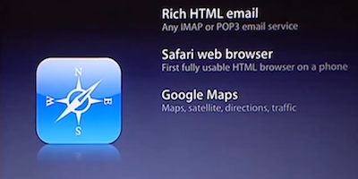
During that epic January 2007 Opera prima from Steve Jobs, among the many subjects touched by this new device called iPhone, was the fact that its had full web browsing capabilities. Meaning, it didn’t use the WAP protocol or any other mobile Internet tricks. Safari reported itself as a desktop browser, requesting the full page as any other computer would do. The objective of this was to enjoy the Internet in all its glamour.
Then the iPhone started selling like crazy, creating an explosion of the smartphone category, on which browsing the Internet normally, was mandatory.
However, while smartphone screens were far bigger than any previous phones, they were still small compared to the desktop counterparts. Full web browsing was possible, but with a certain amount of scrolling. This situation generated a need for a new standard deployed for mobile device browsing. Today there are many, including responsive design, and their objective is straightforward: display the web page for the size limitation encountered on a mobile device.
Difference to WAP, there is no association, nor an agreement on the manufacturer or its content providers. Is just the tacit rule that if your web page doesn’t support mobile, you’re going to lose a lot of audience, since a significant amount of people today browse the web mainly from their mobile device.
Coming full circle
In the end the iPhone triggered a movement that it was conceived to avoid: special web pages for mobile devices.
That has to be one of the biggest ironies on technology deployment.