

As you may or not know, our geo AR platform (Terra Icons) is based on displaying point of interest (POI) in cities by way of using augmented reality. Terra Icons currently covers 70 cities around the world concentrated in 4 services (layers) to display within the mobile app:
- Icons: landmarks of the city, like monuments, museums, buildings, etc.
- Bike station location: If you live in a city which has shared biking services, you’ll know those parking stations are spread out all over the city, as they should
- Metro-Subway: Metro/subway stations location
- Carsharing: The location of parking lots for carsharing services. Currently only Paris, and certain cities of the province of Quebec (Canada) have these layer active within Terra Icons
As you might imagine there are a lot of POIs to display, and it will be really cool to graph them to have an idea on how data is distributed and -in this case- being displayed around the world, sort of an extension of an experiment we previously did.
Thanks to the magic of Watson Analytics we can now visualize how POIs are distributed around the world, so lets get started.
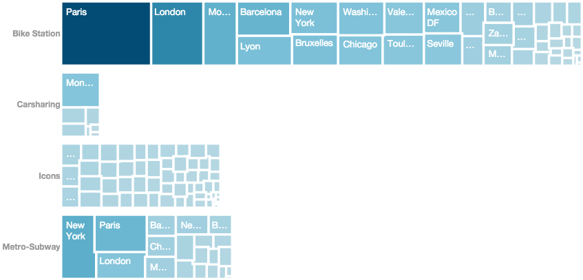
Cities with the most number of POIs
You’ll see the city name and a subdivision, which represents the services (layer) currently active on the city. Not all of them are active on some cities. Paris & Montreal are the only two cities with all four services active (Toronto is a temporary exception).


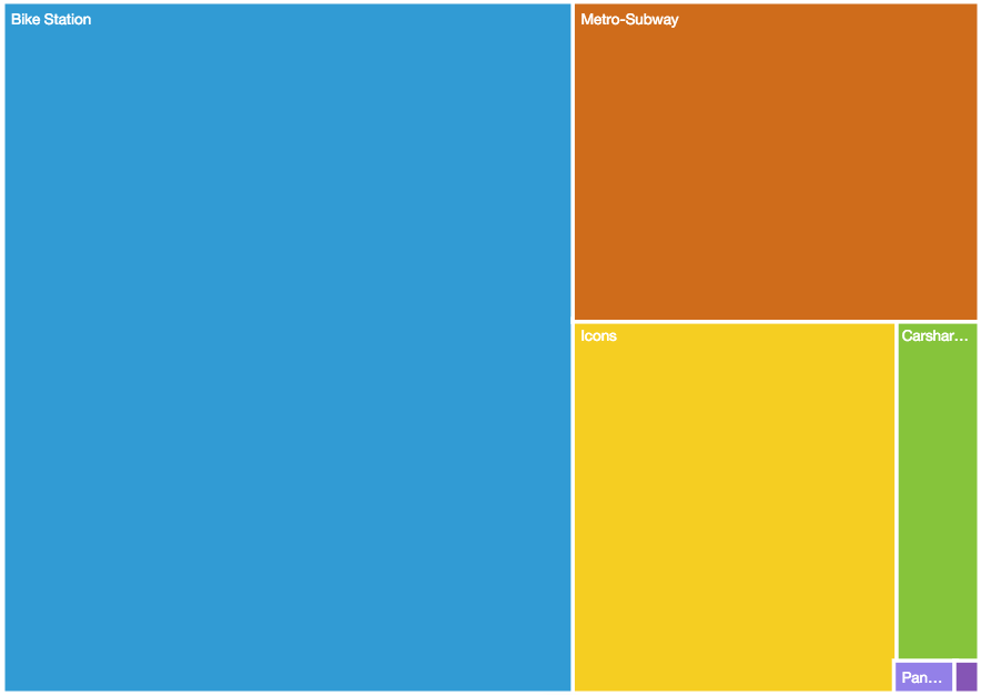
Raw number of POIs per service
Unsurprisingly, biking stations location represent the biggest number of POIs on the whole Terra Icons platform.

Services Distribution
Given the current number of POIs, which city and by how much in relation, has the most numbers of POI? Notice that the Icons is evenly distributed across all cities.

AR keeps growing and with it, our need to display it and augment our vision of the reality (pun intended).